
How to Choose Portrait Painting References (The Key to a Better Painting)
Have you ever sat down to paint a portrait and felt like you were fighting it the whole time, struggling to make the values work, repainting the same area over and over, wondering if you're just having an “off” day?
We've all had those days. But... maybe it wasn't you having an off day at all...
It just might be the photo reference you chose.
I'll be honest- I've made this mistake more than once. I find an inspiring subject with a beautiful model and I'll start painting. But then the struggle sets in. As I find myself repainting the same areas over and over again, making no progress!
Any time this has ever happened, the answer is the same: The lighting just wasn't there.
A great reference photo isn't just about a beautiful subject. It's about the light.
Why Lighting Makes or Breaks a Portrait Painting
When you paint from a photo reference, you're essentially translating what you see into paint. And what you're really translating are shapes of value. Abstract shapes of light and shapes of shadow.
When those shapes are clear and readable in your reference, your job becomes so much easier. You can see what's light and what's dark. You can make confident decisions. The painting process flows so much better!
When those shapes are unclear or low contrast, everything gets harder. You spend more time guessing than painting.
Take a look at these two photos:

The photo on the left has beautiful, clear light and shadow shapes. The shapes are readable and distinct.
The portrait on the right is a gorgeous photo of a beautiful model! But the lighting is pretty flat on her face. There's very little contrast between the light and shadow areas (especially in the cast shadows), which means those shapes are hard to see and therefore harder to replicate those 3D forms in paint.
Here's what happens when you apply a filter to simplify the values in both:

See how the photo on the left still reads clearly even when simplified? The light and shadow shapes are clear.
But on the right, see how we don't have strong cast shadow information? (Like around the eye sockets, under the nose, or falling onto the neck?) That's a sign that the lighting might be difficult to work with for a painting.
(Extra tip: You can apply a Crosshatch filter in Photoshop to any reference photo to preview how the values will simplify. Or Gaussian Blur in Procreate. It's a great way to check your reference before you start painting.)
The Squint Test
You don't even need Photoshop or Procreate to check your reference. There's an even simpler method, and you can do it anywhere.
Squint your eyes down at your reference photo.
When you squint, your eyes naturally simplify what they see. Fine details disappear and what's left are the big shapes of light and shadow. If you squint at your reference and you can still clearly see those big shapes, you likely have a strong reference to work from.
If everything blends into one flat, low contrast tone - that reference is going to make your life difficult.
And with portraits especially, this really matters. Take that second image for example. Yes, her eyes, brows, and hair read as darker values. But beyond that, there isn't much lighting information to work with. We don't have clear form shadows or cast shadows - and those are what actually define the face. Without high-contrast form and cast shadows, painting a portrait becomes a guessing game. And guessing is tiring after a while.
(Form shadows and cast shadows are such an important topic that I'm going to dedicate a full blog post to them soon. Stay tuned!)
This works for any subject, not just portraits. Take a look at these two bird photos:

The bird on the left is so cute. But squint at it and everything melds together.
Low contrast + No clear lighting statement = Difficult to paint.
The swans on the right, even when squinted at, hold their shapes beautifully. The lighting has contrast, and it's clearer and more readable. That's the one that's going to make for an enjoyable painting process. (And likely a better finished painting too.)
What to Look for in a Portrait Reference
When you're searching for portrait references, here's what you want to see:
Clear and readable shapes of light and dark. Look particularly for clear cast shadows- especially under and around the nose, the lips, under the chin onto the neck, and even cast shadows from shirt collars! If you can see these cast shadows clearly, you're likely in great shape. This is the easiest type of reference to paint a portrait from.


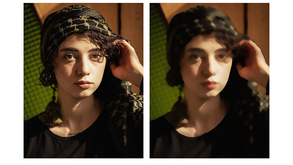
See how clearly those cast shadows read in the simplified versions in the examples above? That's exactly what you're looking for.
Does this mean you can't paint a portrait unless it has these things? Of course not! As your skills grow, so will your ability to work from all kinds of references. But if you're a beginner or intermediate artist looking for an enjoyable portrait painting experience, go for a reference that has these traits. Your future self will thank you. :)
Where to Find Portrait References with Great Lighting
Finding references that tick all these boxes can be tricky, especially on free stock photo sites. I've put together a separate post with my favorite places to find high-quality portrait references - including free options, paid resources, and a few tips for taking your own.
Ready to Paint Better Portraits?
If you want to go deeper into portrait painting, including how to start, values, and more, my free Portrait Art Starter Kit is a great place to learn. It's completely free and packed with resources to help you build a strong foundation.👇

A R T I S T F R E E B I E
Portrait Art Starter Kit for Procreate
Learn lighting for portraits, proportions, and how to conquer the blank canvas! In this free mini-training, we’ll dive into the three foundations of portrait art- values, proportions, and lighting- which will simplify your painting process.
